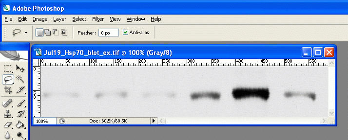
|
(转自丁香园,感谢sighman1983网友分享)
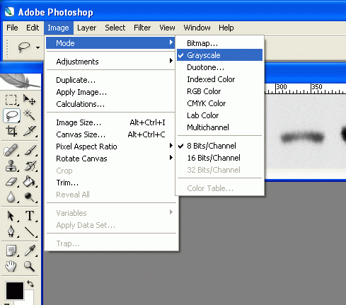
2. Under Image>Mode, check the grayscale option if it's not already selected. We don't care about color information, only grayscale information, so we can discard the color information.
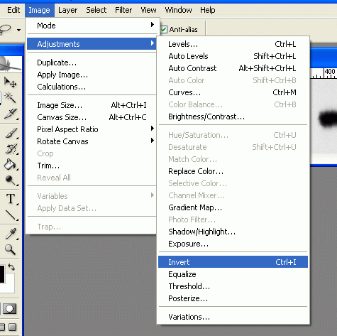
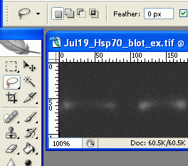
3. Under Image>Adjustments, select Invert (or press Ctrl+I). Now the dark parts of the film are light, and the light parts are dark. This is useful later, as the high-expression bands, which are dark on the film, will have high numerical values when we measure them. When photo programs report darkness/lightness values, the dark points have values near zero, and the light points have values that max out at 255.
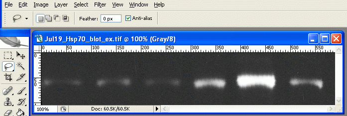
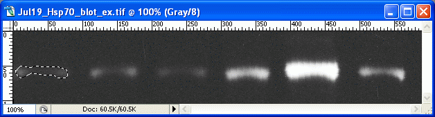
The inverted scan 4. Choose the lasso tool from the tool palette.
5. On the first band, use the lasso tool to draw a line all the way around the edges of the first band. This is where your judgement comes in to play, determining where the edges of the band are, and what is simply background.
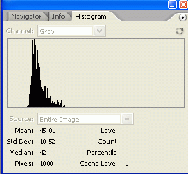
6. For Photoshop CS2/3: If the histogram window is not open by default, go to Window>Histogram to open the histogram. In newer versions of Photoshop (CS2, CS3) there is a small arrow in a circle in the upper right corner of the histogram window. Click on this and choose 'expanded view' to show the values for your selection. For Photoshop v.5+6: Go to Image>Histogram to display the histogram for the current selection. 7. The histogram information includes a "Mean" value and a "ixels" value. Record these two numbers for your selection. The Mean value is the average gray value (from 0 to 255) for the area inside your selection. The Pixels value is the number of pixels contained in your selection area. Bands with high expression are typically darker, but also often larger in size, so we want to know both of these attributes for our comparison later.
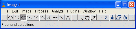
8. On your picture, use the lasso tool to draw around the next band. Record the Mean and Pixel values for this selection. Repeat for the rest of your bands, including your standard. ___________________________________________________________________________ The ImageJ method (version 1) The good news is that even if you don't have access to a photo editing program such as Photoshop, you can now do all the same analyses using free programs. My favorite option is the freely available ImageJ from the National Institutes of Health. The homepage for ImageJ is here: wherein you can find links to the download, documentation, additional plugins and so on. Once ImageJ is installed, open it up and open your scanned film file. We'll start the ImageJ section by duplicating the method outlined above for Photoshop. 1. Open your file. 2. Under Image>Type click on 8-bit to convert the image to grayscale. 3. Go to the menu Process>Subtract Background. Try a rolling ball radius of 50. This removes some of the background coloration from your image. 4. Go to Analyze>Set Measurements, and click the boxes for Area, Mean Gray Value, and Integrated Density. 5. Go to Analyze>Set Scale, and enter "pixels" in the box next to Unit of length. 6. Go to Edit>Invert (or hit Ctrl+Shift+I) to invert the colors on the image. Now the dark areas are light, and the light areas are dark. As outlined above, this has the benefit of making the measured values for bands increase with increasing protein expression. 7. Choose the Freehand Selection tool from the tool palette.
8. Draw a line around the boundary of your first band. As above, you need to use your own judgement about where the edges of the band are, and what is simply background noise.
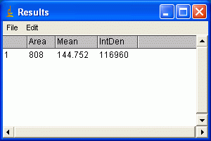
9. Hit the m key to take a measurement of the enclose area that you selected. The Results window should pop up, and each of the measurements you selected in step 4 should appear. Note that the Integrated Density column is simply the Area and Mean Gray Value columns multiplied together.
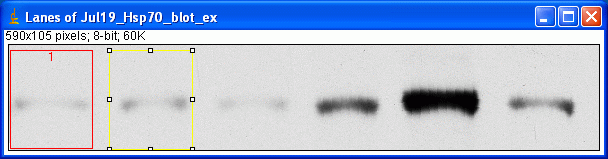
10. Use the Freehand Selection tool to select the next band, and press m to take the measurement. Repeat this for each of you bands, including the standard. 11. When you are finished, you can go to the Edit menu in the Results window, and choose Copy All. You can then paste the results into a spreadsheet for later use. _____________________________________________________________________________ The ImageJ method (version 2) This method is the Gel Analysis method outlined in the ImageJ documentation: . You may prefer to use it instead of the methods outlined below. There will likely be very little difference in the results between the various methods. 1. Open your file. 2. Go to Analyze>Gels>Gel Analyzer Options and click the boxes for Label With Percentages, Outline Lanes and Invert Peaks. 3. Choose the Rectangular Selection tool. Draw a rectangle around your first lane. Encompass some area of the lane above and below the band of interest. Edit July 2009: Note that for a gel with the lanes oriented vertically as shown here (i.e. the visible bands are horizontal across the image), you want to make your bounding rectangle taller than it is wide. However, if you have the image rotated so that the lanes are running horizontally, you need to make your bounding rectangle at least twice as wide as it is tall, at which point Image-J will recognize that your lanes are horizontal and it will allow you to move the box up or down the image to enclose the neighboring lanes. 4. Press the 1 button (or go to Analyze>Gels>Select First Lane). A new window will pop up with a copy of your image and a label over your first rectangular selection.
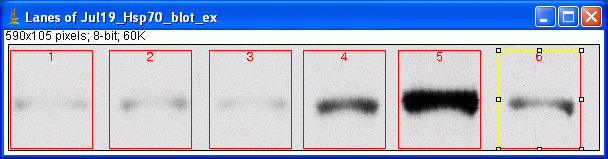
5. Use the arrow keys to move the rectangle over the next lane. Press 2 (or go to Analyze>Gels>Select Next Lane) to place a selection around the lane. Repeat this for each lane on the membrane, moving the box and pressing 2 to place the selection.
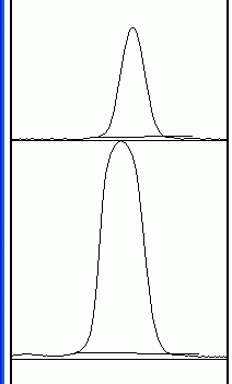
6. When finished, press 3 (or go to Analyze>Gels>lot Lanes), which pops up a new window with a profile plot of each lane.
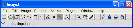
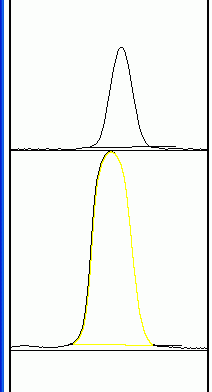
7. Now choose the Straight Line selection tool. At the base of each peak, draw a line from one side of the peak to the other. This encloses the area of the peak. The tails to either side of the peak are the background signal. Note that if you have many lanes, the later lanes will be hidden at the bottom of the profile plot. To see these lanes, press and hold the space bar, and use the mouse to drag the profile plot upwards. 8. When each peak has been closed off at the base with the Straight Line tool, choose the Magic Wand (Wand tracing tool) from the tool palette.
9. Using the spacebar and mouse, drag the profile plot back down until you are at the top peak. With the wand, click inside the peak. Repeat this for each peak as you go down the profile plot.
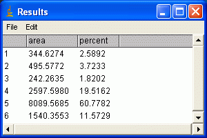
10. When each peak has been selected, go to Analyze>Gels>Label Peaks. This labels each peak with its size expressed as a percentange of the total size of all the measured peaks. You can go to the Results window and choose Edit>Copy All to copy the results for placing in a spreadsheet.
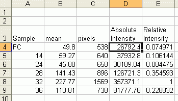
Note: If you accidentally click in the wrong place with the Magic Wand, the program still records that clicked area, and it will factor into the total area used to calculate the percentages. Obviously this would skew your results if you click in areas that aren't peaks. Therefore, if you should click in the wrong place, simply go to Analyze>Gels>Label Peaks to plot the current results, which displays these incorrect values, but more importantly resets the counter for the Results window. If you now go back to the Profile Plot and click in the peaks with the Magic Wand, the Results window clears and starts over. When you're sure you've clicked in the correct peaks without accidentally clicking in any wrong areas, you can go back to Analyze>Gels>Label Peaks and get the correct results. __________________________________________________________________________ Data analysis 1. Once you have measured the values for all of your bands, enter your numbers in a spreadsheet. Make a list of your samples on the blot, and then two adjacent columns of the Mean and Pixel values for each sample's band. (Note, if you used Image J's Gel Analysis routine, simply paste in the percent values for each sample) 2. Multiply the Mean value by the Pixel value for each band. This gives us an integrated measure of the intensity and size of the band. I'll refer to this as the absolute intensity. (Note: if you used ImageJ's Gel Analysis routine, this step does not apply)
3. Next we'll calculate a Relative Intensity, using our standard as the common point of comparison. Divide the absolute intensity of each sample band by the absolute intensity of your standard to come up with a Relative Intensity for each sample band. Some bands will have a Relative Intensity lower than 1 (they have less protein than the standard), and some bands might have a Relative Intensity larger than 1 (they have more protein than the standard). The Relative Intensity is a unitless value. (Note: if you used ImageJ's Gel Analysis routine, divide the percent value for each sample by the percent value for the standard from that membrane to get a value equivalent to Relative Intensity) 4. If you have the same sample standard on multiple membranes, you can compare intensity values across multiple membranes, even if you had to expose them for different times. By calculating a relative intensity that is tied to the same sample standard on every membrane (10ng of Human Hsp70 for example), we can make up for variations in the length of film exposure or variations in the efficiency of the antibodies or other reagents. 5. In order to test for significant differences between treatments, all of your membranes will need to be scanned and quantified, then expressed in terms of Relative Intensity. If you are going to test for treatment effects using a standard analysis of variance, you will need to ensure that your Relative Intensity values are normally distributed and that there is homogeneity of variances within each treatment. A log transformation is often needed to make Relative Intensity values approximately normally distributed, but this may vary depending on your data. The complete statistical analysis of the data is outside the scope of this article, please consult a statistics textbook for more information. 6. For making figures, your data can be plotted as Relative Intensity versus the treatments, and most papers typically use the standard error of the mean for the error bars. It should be noted here that some researchers make the extra effort to include a set of serial dilutions of a known standard on each Western Blot. Using the serial dilution curve and the quantification techniques outlined above, it should be possible to express your sample bands in terms of picograms or nanograms of protein.
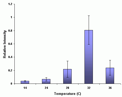
An example figure showing increased expression of a protein at high temperatures Addendum With regard the the Image-J gel analysis routine (method 2 above), there has been some question of what the values reported by Image-J correspond to. The images below may help illustrate what Image-J is measuring.
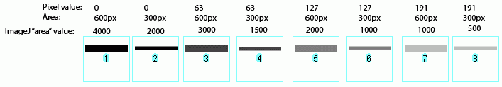
In the image above, I have drawn out a set of fake "bands" in Adobe Illustrator. The gray value and area of each band are listed above the band. Additionally, I have included the "area" value returned by Image-J after plotting the bands and clicking in each peak with the Wand tool. Note that these "area" values are a RELATIVE measure of the size and density of each peak you clicked with the wand tool. When you halve the area of a band, but maintain the same gray value (compare lanes 1+2), the value reported by Image-J is half as large. By the same token, if you halve the gray value but maintain the same area (compare lanes 1+5), the value reported by Image-J is halved.
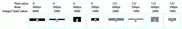
The same holds true for bands of different shapes. In the image above, altering the shape of the band, but maintaining the same gray value and area (compare lanes 1+3) yields an equivalent value from Image-J.
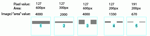
Image-J also accounts for gaps in a band, as shown above. Compare lanes 1+3, which both have an equal number of gray pixels and equal gray values (i.e. equal amounts of protein on the gel). Image-J reports the same "area" value for both of these lanes. It is worth reiterating that the "area" values and percentages reported by Image-J are always relative to the total size and density of bands that you have selected in a particular image. In the image immediately above, the band in column 1 returns an "area" value of 4000, while in the previous two images column 1 had the same size band, but with twice the gray value, which in both cases also returned a value of 4000. The raw values returned by Image-J are meaningless for comparing across different gels, since they are only a relative measure of the bands you've highlighted on a particular gel image. This is why we need to standardize to some common standard loaded onto all of the gels. (Edit July 2009) This may be a bad sign for my career, but it seems that this set of instructions is quickly on its way to becoming my most heavily cited publication in the scientific literature (see my "real" publications here (pdf) ). For instance: Corpas F. J., et al. 2008. Metabolism of Reactive Nitrogen Species in Pea Plants Under Abiotic Stress Conditions. Plant Cell Physiology, 49(11): 1711-1722 Luhtala N. & Parker, R, 2009. LSM1 over-expression in Saccharomyces cerevisiae depletes U6 snRNA levels. Nucleic Acids Research, doi: 10.1093/nar/gkp572 Miller, R. K. et al. 2009. CSN-5, a Component of the COP9 Signalosome Complex, Regulates the Levels of UNC-96 and UNC-98, two Components of M-lines in C. elegans Muscle. Molecular Biology of the Cell Chiang, E. T. et al, 2009. Protective effects of high-molecular weight Polyethylene Glycol (PEG) in human lung endothelial cell barrier regulation: Role of actin cytoskeletal rearrangement. Microvascular Research 77(2): 174-186 (责任编辑:泉水) |
用photoshop进行Western Blot 图片灰度分析
时间:2012-07-27 12:27来源:网络 作者:未知 点击:
8498次

顶一下
(1)
100%
踩一下
(0)
0%
------分隔线----------------------------
- 发表评论
-
- 最新评论 进入详细评论页>>
- 特别推荐
-

- 推荐内容
-
- 凝胶迁移或电泳迁移率实验(EMSA)
Monday, November 24, 2003 Description Electrophoretic Mobility Shift Assay (EMSA)...
- 凝胶迁移或电泳迁移率实验(EMSA)